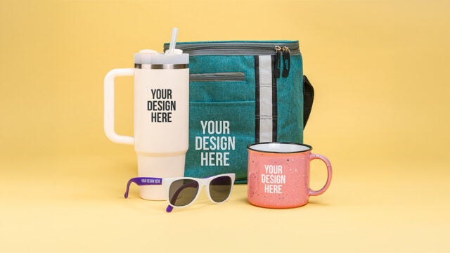
You don’t need to already have a logo to order a customized product from us. Yes, we’re excited too!
Maybe you’re ordering products to celebrate a wedding, family reunion, or duck-herding tournament. You probably haven’t created a logo specific to these events, but you still want to get your sentiment across on the swag you hand out.
Fortunately, there are loads of tools and tips you can use to craft an image and/or message that will look perfect on whichever product you choose. Here are the tools – and the rules – we recommend.
The Tools
In the 21st century, you’re not going into this task empty-handed. In addition to cat videos and popup ads, the internet has endowed upon us a variety of tools you can use to create genuinely impressive custom designs.
Logo Builders
You don’t need a graphic design degree to create your own logo. These logo builders guide you through the process, often for free. Check out:

We’ve even got another blog post where you can learn more about the pros and cons of some of these. Whichever one you prefer, using one of these builders is much easier than going it alone with a half-formed idea and a rudimentary knowledge of Paint.
Free Font Library
No offense to Arial, but there’s a whole world of fonts out there that may be a better fit for what you need. You can find a lot of them in our free font library. You can also preview what your specific text will look like in your chosen font, for an instant vibe and readability check.
Free ClipArt Library
In addition to fonts, we’ve provided you with a selection of free simple pictures you can add to your custom product in our ClipArt library. You can download and use these in one of the logo builders, or add it to your design on our website. And if you can’t find what you want, our team will create it for you.
The Rules

These are less rules than guidelines, since some of the most memorable logos break all generally accepted design mandates. For example, mermaids have nothing to do with coffee, the Olympic rings have five whole colors to remember, and the “D” in “Disney” looks like a back-to-front “G.” However, if you’re stuck on how to get started, these can be useful to keep in mind.
Choose and Format Your Words Carefully
If you’ve ever received an email from someone who didn’t believe in the concept of paragraphs, you’re familiar with what is commonly termed a wall of text.
People struggle to focus on long blocks of words. Try to get your message across in as few words as possible. Yes, this makes me a hypocrite – but less is more when you want to keep your words visually and literally interesting.


Match Your Font to Your Message
Fonts are designed to add personality to your words – so make sure you choose one that matches the tone of your message.
For example, a cursive font on a wedding invitation equals elegant and romantic, which is probably what you want. A cursive font on a warning sign equals elegant and romantic, which is probably not what you want.
This example also demonstrates the importance of choosing a font that’s legible. Wedding invitations are supposed to slow the reader down, which is why cursive can work so well on them. However, cursive on a warning sign is less, “Aww” and more, “Wait, what does that sign say-aaahhh.”
Pick Your Picture
As you’ll notice when you explore our ClipArt library, simple silhouettes typically look better on products. For one thing, details tend to get lost, especially on smaller products, so we recommend using designs without a lot of linework. Also, you want to catch people’s attention quickly, so it’s better to give them an image they can understand in one glance.


Make the Most of Your Space
Another reason to err on the side of minimalism in your design is if you’re working in a small space. If you have flexibility over the product you’re choosing, go with one that works with your vision of the design you’re creating. For example, pencils can fit relatively long sentences, but not tall pictures, and the opposite is true for a pint glass.
Respect Color Theory
Product color preferences are subjective, but there are theories about which colors look best together. These are bundled together as color theory.
Color theory usually starts with a color wheel. Without getting too into the weeds, there are two simple ways to use a color wheel to find colors that go well together.
 Designed by macrovector / Freepik
Complementary Colors
Not to be confused with colors that tell you that you look fabulous in that sweater. Complementary colors complement each other — they look good together. They’re easy to find, because they sit opposite each other on the wheel. For example, red and green, orange and blue, or green and purple. Combine these and you’ll be getting compliments on your complementary colors!
Analogous Colors
Using a 12-color wheel, choose your color, then look at the two either side of it. These are its analogous colors. For example, yellow through orange, green through yellow, or purple through blue.

Contrast Your Colors
It’s also a good idea to choose colors that will stand out from each other. You can do this by considering color values. This doesn’t mean how much you like a color: it’s thinking about colors on a spectrum from dark (low value) to light (high value).
If you’re working with two colors, choose one light and one dark. For example, a dark orange with a light blue. If you’re working with three, choose one dark, one light, and one medium. So maybe, a dark orange, a medium blue, and a white. This will ensure they contrast well enough to stand out.
Top Tip: To check if you have enough contrast, convert your design to black and white. This exaggerates the differences and similarities between the colors, so you can see how well they contrast.

The Bottom Line
You can order customized gifts from us even if you don’t currently have a logo. You have access to an impressive range of tools, along with some guidelines, to help you build your own design from scratch. Plus, our team is on board to help you get the look you’re going for, even if this is the first time you’ve ever tried to design a custom item.
So whether you’re getting married, connecting with your family, or herding ducks, you can have shared customized products to commemorate the occasion.
Natasha Lavender
Natasha is an experienced writer and editor who has covered topics including technology, health and safety, business, and pop culture. Her work has been published by Good Housekeeping magazine, Forbes, Success, and more.