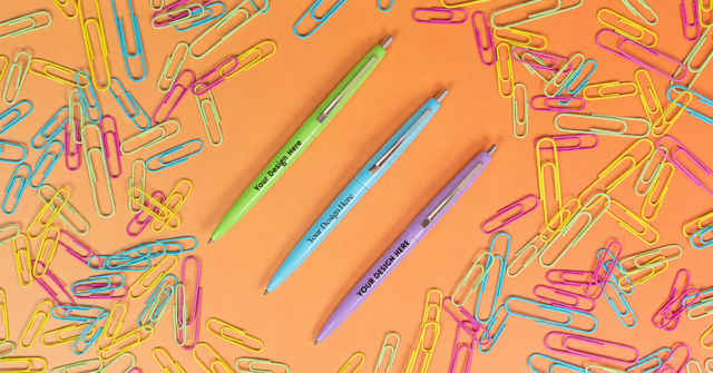
In our unbiased opinion, ordering online is super convenient – but if there’s one drawback, it’s color matching.
How do you know that those brilliant orange t-shirts you’ve got your eye on for your Snail Olympics are really that perfect shade in real life? Is that blue imprint color sky blue or navy?
We want to make sure you can trust that the promos and imprints you’re ordering are the same color in reality that they appear on your screen. That’s why we’re so into monitor display colors.
Every time you look at one of our products online, technology has been working behind the scenes to translate that image from code into an accurate representation of the colors in the original photo. Sometimes things get lost in translation: however, there are ways to keep color consistent.

Why Different Monitors Show Colors Differently

Even though people who design monitors try to ensure consistency, it’s hard to do. There are different components of color creation and interpretation that have to work together. And you’re relying on tiny LEDs in individual screens to work exactly as programmed, even when they’re made by different manufacturers. And that’s before you take into account users having different settings.
Wrong Color Gamut/Color Profile/Color Space
Wrong what? These are all components that go into making that promo pen on your screen look that particular shade of banana yellow. The closer these components align, the more accurate your colors.
Color Model
How colors are made. In screens, it’s by using different combinations of red, green, and blue LEDS. (This is the RGB color model – find out more here.)
Color Space
Determines which of all those possible colors you can actually use, and names or numbers them for organization. Most monitors default to the sRGB color space, since that’s what most websites use. However, people who work with detailed color (like photographers) often use Adobe RGB. Both of these color spaces use a portion of the colors you can create through RGB, but Adobe RGB includes more colors than sRGB.
Color Gamut
The color range your monitor can actually create, based on its technical specs.
Color Profile
The code tells the color profile which colors to use. The color profile compares that information to the color space and color gamut of your monitor, and based on that, it tells your monitor how to create the correct color.
Inconsistencies in color occur when different devices – our camera, your phone, etc – use different versions of these components. For example, say we edit our photo of a stress ball on a computer in the Adobe RGB color space, and you’re looking at it on a smartphone that uses sRGB. Our original photo may use colors that don’t exist on your phone. That means your phone has to estimate the colors it should use to recreate the photo, which may make the image appear different than the original.
Think of these components working together like a game of Telephone. They’re trying to pass accurate information about the colors of the original photo along to the monitor, so it can show you as closely as possible what color that stress ball is. In the best case scenario, all the players are fluent in one language, so sharing information is easy. But sometimes, one person is fluent while the next person only knows a few words. Every time, some information is lost and each player has to estimate what the last person whispered to them – and that’s how discrepancies creep in.
Screen Resolution
You probably know about pixels: the tiny squares that make up your display. Low resolution means fewer pixels, high resolution means more pixels. Most modern screens are high definition (HD), which means they have 1920 x 1080 pixels – that’s over 2 million tiny squares your device can use to convey blocks of color.
When screens have to scale images up (to go from a low resolution to a high resolution) or down (high res to low res), they’re making an estimation of the image, including the colors. Either there’s information missing (low res to high res) that it has to fill in, or there’s too much information (high res to low res) and it has to decide what to cut.
If you’re looking at a photo of a promo product that was taken in 1920 x 1080 on a device with a lower resolution (an old computer or a small smartphone), your old screen doesn’t have as many pixels to use to convey color detail. It skips some and merges some together, and you get an estimation rather than an accurate recreation.

Bit Depth
Bit depth is related to screen resolution. Screen images are made up of pixels, and pixels are made up of dots of color in red, green, and blue, called bits. Monitors with more bits can display more colors – like how more pixels means clearer images – although most displays today are 24-bit, which gives a total of over 16.7 million possible colors.

Since humans can only see 10 million colors, and most devices can’t show all 16.7 million of these colors anyway, this should cover every single color a human could see and a screen could display. So 24-bit color is often called true color. However, we are better at seeing some colors than others (we’re not great at blues), and so there are some colors inside that 16.7 million range that we can’t see, and some colors that fall outside that 16.7 million range that we can see.
That’s why some people (mainly gamers) use monitors that give each channel 10 bits (theoretically that’s over 1 billion possible colors.) If you’re looking at an image that was made on a 10-bit monitor on your 8-bit monitor, the original might include colors that your monitor can’t replicate. Again, there’s a disconnect between the amount of information each device can display.
Color Temperature
Say you’re trying to work out what color imprint will stand out best on a green stress ball, but the shade of pink you’ve chosen looks sort of orangey on one monitor and bluer on another monitor. It may be because of your color temperature settings.

Color temperature on monitors is measured in Kelvins (K), which are also used to measure actual cold/heat-related temperature (not just visual temperatures.) In contrast to how we usually understand temperature, a lower number of Kelvins equals a warmer (yellower) color, and a higher number equals a cooler (bluer) color.

Contrast
If you happen to be scrolling through our promotional tote bags and thinking they look a little muted on your screen, it could be that your contrast is too low. Contrast is the difference in brightness between the darkest black and the brightest white, but it affects other colors too: High contrast makes bright colors brighter and dark colors darker.
Contrast is usually based on a ratio, where the first number represents the light side and the second number represents (puts on Darth Vader voice) the dark side. So a contrast ratio of 1,000:1 indicates that the brightest white is 1,000 times brighter than the darkest black. The closer you get to 1:1, the lower the contrast.
Frustratingly, there are no contrast units of measurement, it’s relative depending on your monitor. And ambient light – light that’s hitting your screen – can affect how you perceive contrast. It’s why you turn the contrast up when you’re trying to watch TV on a sunny day.
Technical Difficulties
So far, the reasons for color discrepancies are just part of normal functioning monitors. However, if your monitor is showing photos as wildly different from other screens, you might also have a technical issue. Anything that disrupts the signal between your computer and your monitor can lead to incorrectly rendered colors. That can include an overheated or faulty graphics card/GPU (the GPU is the part of the graphics card that actually communicates with the computer), electromagnetic interference, or damaged cables.

How To Adjust Your Monitor To See Colors Accurately
If reading everything up to this sentence has made you concerned that your monitor has been lying to you this whole time (what do you mean you didn’t know this text is magenta), there are steps to calibrate your monitor for improved color accuracy.

The “Good Enough” Way
Good news: People who make computers and monitors also care about how they display color, so they often include built-in color calibration software. It will walk you through basic adjustments to get your display to meet basic color standards, including red, green, and blue balance, and contrast. There are also online calibration tools like this one by EIZO, a company that makes high-end monitors (so they know a few things.) This should give you the confidence that the bright blue promo mug you have your eye on is indeed bright blue, and that grey imprint color is still light enough to stand out clearly.
The “Super Accurate” Way
If you want your color calibration to be as accurate as humanly possible, you can get a device called a colorimeter. This can measure the colors on your screen against a baseline and adjust the settings automatically. It even factors in the ambient light. However, unless you are absolutely determined to know the EXACT shade of blue of that mug before you purchase, this is overkill for most users.

Use the Pantone Matching System To Guarantee a Product’s True Color

Unless you work closely with color, you may know Pantone only as the company that gives colors numbers, and names the Color of the Year. Or you may know them from the frankly riveting blog post I wrote about them and the Pantone Matching System (PMS). Since you could just read that blog post (if you wanted to, no pressure or anything) I’ll keep it short here.
To tackle all these color consistency challenges, Pantone created a system that allows two parties who both have the same Pantone catalog to look up colors independently and know they’re seeing the exact same thing. This means that if you want your imprint to be your brand’s specific Pantone color, you can tell our wonderful customer service team the Pantone number and we can match it. That way, you don’t need to rely on your monitor to know that the color is correct.
The Bottom Line
The people figuring out color consistency on monitors have tried to make the colors you see on our website match the colors we see. Industry standards like sRGB and screen resolutions help, and you can also calibrate your screen. However, there’s going to be variation, so if you have any concerns, reach out to us and we’ll do our best to help.


Tap image to zoom, then drag to move.
Natasha Lavender
Natasha is an experienced writer and editor who has covered topics including technology, health and safety, business, and pop culture. Her work has been published by Good Housekeeping magazine, Forbes, Success, and more.