Fonts make a big difference to your reading experience, especially in a small space.
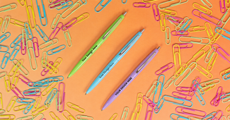
Most of our pens have a maximum imprint size of around 2” W x 0.5” H. (Check individual product pages for exact measurements.) That means you need a font that can be read when it’s small, which also fits in with your brand’s visual identity. Here are the main factors to consider when you’re printing on pens, to get your message looking its best.

Typeface vs Font
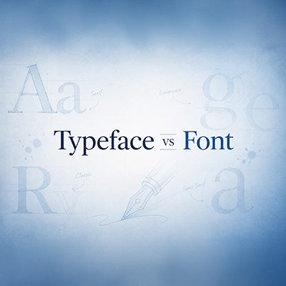
We’ll level with you. Most of the time when people (including us) talk about fonts, what we’re really talking about is typeface.
Typeface is a style of lettering: this is what determines whether your fonts are curly or straight, the spacing between letters, how tall and wide different letters are. Essentially, what makes the letters look a certain way. The font is a specific version of a typeface. For example, bold or italic, 12pts or 8pts.
Arial, Times New Roman, Helvetica etc are typefaces, but are commonly referred to as fonts. Helvetica Light is a font, because it’s a light version of the Helvetica typeface.
Now you know, we’re just going to go ahead and do what most people do, which is use the words interchangeably.
Font Features to Look Out For
You can get very nerdy about fonts, and people do. But here are the key things to consider when you’re choosing a font specifically for your promo pens.
Serifs and Sans-Serifs
One of the most fundamental differences between fonts is the presence or absence of serifs. A serif is a little line that sticks out at the top and bottom of letters. (Technically the little lines come at the beginning and end of strokes: strokes are the individual lines that make up letters.) The most famous serif font is probably Times New Roman.
As you may have deduced, sans-serif fonts are fonts that don’t have serifs: sans means “without” in French. Arial and Helvetica are two examples of sans-serif fonts.
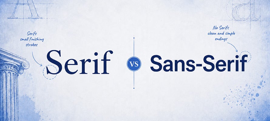
Whether you prefer serifs or sans-serifs comes down to personal taste. Serifs give a font some old-fashioned gravitas. It’s like your font is speaking with a posh British accent. Most books are printed in serif fonts, because the lines carry your eyes from one word to the next, which is helpful when you’re reading long lines and paragraphs.
However, those serif lines don’t show up so well when they’re printed small, as on a pen, and can make your text look crowded and harder to read. Sans-serifs are considered more modern and down with the kids, as the kids don’t say. They have the added benefit of being easier to read at smaller font sizes.
Decorative and Script Fonts
Script fonts are designed to look like handwriting. Nice handwriting, not my handwriting. They’re often cursive, with big swooping letters and lots of flourishes – although not always. For example, Lucida Handwriting and Lucida Calligraphy are script fonts from the Lucida typeface that have cursive elements, without being as dramatic as, say, Edwardian Script ITC or French Script MT. (If you ever had to pretend to write a historical diary or letter in high school, you probably typed it in one of these two)
Decorative fonts are also flashy: They’re designed to make a visual impact rather than to clearly relate information. Examples include Jokerman, Curlz MT, and Bleeding Cowboys.
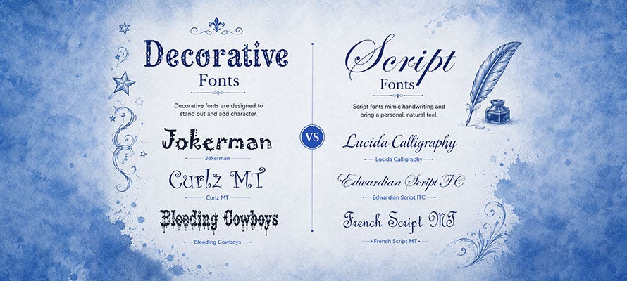
These fonts are fun and exciting and stand out in a world of boring sans-serifs. But they prioritize wow-factor over legibility, which can be an issue when they’re printed small. If you can’t resist the call of calligraphy, we recommend only using it for one word, not in all-caps, and nothing you really want people to be able to read, like an email address.
Kerning, Bowls, Counters, and X-Height
Um what? Essentially: Don’t choose a font that’s super squished together!
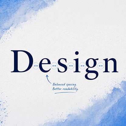
Kerning
Kerning means the space between two letters in the same word. A proportionally bigger space makes the letters easier to distinguish from each other when printed very small. That said, you don’t want a space so large that you can’t tell that the two letters are part of the same word.
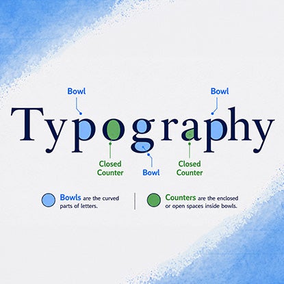
Bowls and Counters
Not a messy breakfast bar. A bowl is a curved line in a letter that creates an enclosed space. The word “bowl” has two bowls, one in the “b” and one in the “o.” The space the bowl creates is called a counter. A fully enclosed space is called a closed counter, like in “o” or “a” or “g.” An open counter is when the rounded space the bowl creates is open on one side, like in “c” or “u.” Fonts that have round, clear counters are easier to read at smaller sizes.
X-Height
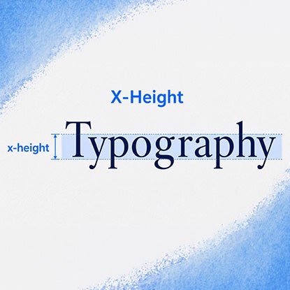
The term x-height means how tall your lowercase letters are – it’s where the top of the “x” sits. Generally you want a taller x-height for smaller sizes, but not always. Instead, think about it in proportion to the height of the ascenders, which are those lines on letters like “l”, “t” and “h” that stick up above the x-height. Your x-height needs to be tall enough for your lowercase letters to be legible, but not so tall that the ascenders suddenly look weirdly short.
Hierarchy
Designers use fonts to convey different levels of importance between groups of text. Think about book covers: Most of the time, the title is the biggest, boldest piece of text on the cover, because that’s what the publisher hopes will draw you in. However, books by really popular authors tend to make the author’s name much bigger: think Stephen King, Dan Brown, or Lee Child. In these cases, the exact title doesn’t matter as much as knowing who wrote it.
You can apply this to a small space like a pen by considering the factors that affect hierarchy, including text placement, size, and boldness. The most important text is the biggest, goes at the top, and can be in bold. A great tip is to use the golden ratio to come up with your font sizes: take your smallest font size and multiply it by 1.618 to get the next size up, and so on.
Subjective Metrics
Trends
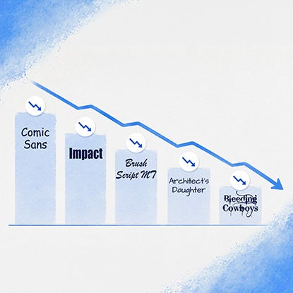
Like jeans, sneakers, and TikTok videos, fonts have trends. The problem with trends is that they date your product to a very specific time, which can feel outdated very quickly. For example, the fonts Comic Sans, Impact, Brush Script MT, Architect’s Daughter, and Bleeding Cowboys are all very emblematic of particular periods in time, and therefore don’t feel modern.
A trendy font is fine for something that’s only temporary, like a social media ad or a billboard. But if you want people to keep using your promo product for as long as possible, choose fonts with longevity rather than status. (Right now, that means avoiding fonts like Ogg: you’re welcome.)
Unpopular Fonts
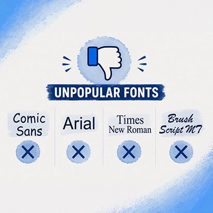
Similar to trendy fonts are fonts that are widely disliked for purely subjective reasons, usually relating to them being overused in a particular sector. Comic Sans is enemy number one, but a lot of people also dislike Arial, Times New Roman, and Brush Script MT.
In case you’re lucky enough to have never seen a Reddit discussion about the worst fonts, and you think no one could possibly get that worked up about them, keep in mind that there is an SNL sketch about the font Papyrus.
Vibe Check
Human brains are good at playing weird tricks on us, like turning randomly arranged objects into smiley faces, and projecting feelings onto fonts. It’s the same reason it feels like words written in all caps MEAN SOMEONE IS SHOUTING AT YOU.
Think about the mood you’re trying to convey with your custom pens. For example, hotels want a warm but professional font, probably a serif. For a wedding, if you’re printing initials, you can get away with cursive – unlike a law firm that needs to look authoritative and show information clearly.
Fonts let you add another layer of meaning to your message, so make sure you’re striking the right tone.
Top 5 Fonts to Print on Pens
Feel like you’re overthinking it? Don’t worry: Here are the five pen fonts we recommend:
-
1
Futura: Despite being 100 years old, Futura has a so-retro-it’s-modern feel. It’s based on geometric shapes, which make it stylish and readable.
-
2
Garamond: If you can’t resist a serif, Garamond is a good choice, thanks to the kerning that helps to make it readable at small sizes.
-
3
Myriad: A sans-serif designed to be easily adaptable for different sizes and uses. Apple even used it as their official font for a while!
-
4
Helvetica Now (Micro): Helvetica is one of the most common typefaces in the world. This version was created specifically to make it work better in small spaces.
-
5
Bell Centennial: A sans-serif originally invented for AT&T’s phone directories, which required a font that could be legible when printed at small sizes.
The Bottom Line
Now you’ve finished this post, prepare to start having strong feelings about brands’ font choices – and to feel more confident when it comes to choosing the font for your own custom pens.
Natasha Lavender
Natasha is an experienced writer and editor who has covered topics including technology, health and safety, business, and pop culture. Her work has been published by Good Housekeeping magazine, Forbes, Success, and more.